Google Play
Global Brand Redesign
—
R/GA, 2020
A Global Rebrand that’s Reflective of Every Side of Play
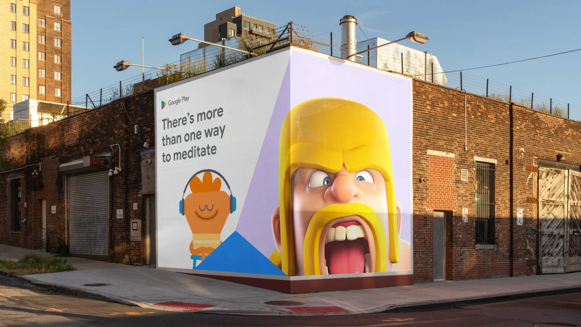
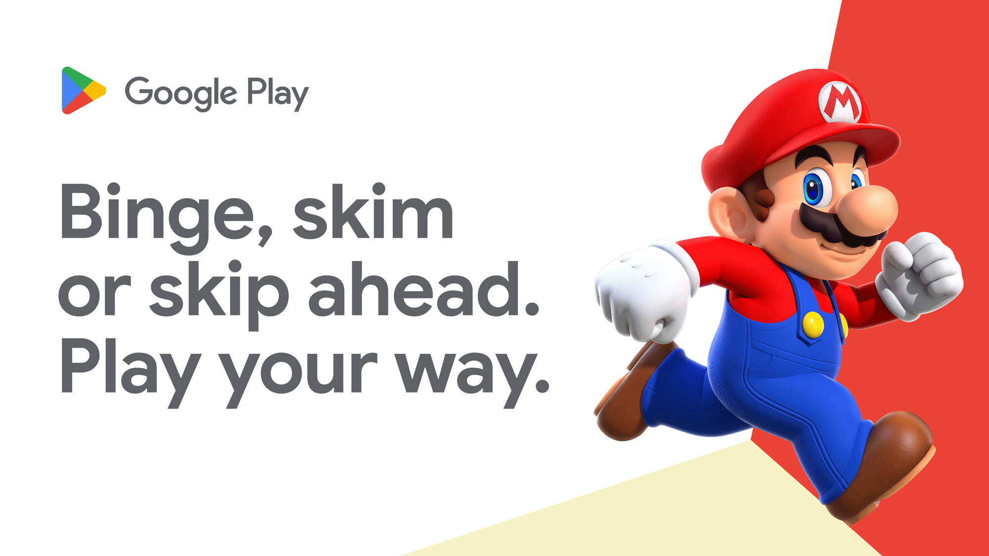
One of the largest marketplaces in the world had become purely transactional. As a result, Play wasn't living up to the spirit of its name and was missing the opportunity to encourage new behaviors, particularly the act of discovering something new. The core of the brand evolution started with Play's own equity. We saw untapped potential in the legacy of Google Play's logo, commonly referred
to as "the Prism."
We honed in on the idea that prisms aren’t static but active and multidimensional––just like discovery. Revealing an opportunity to build a brand that unlocked an entire spectrum of Play. The redesign shifts the prism from a static logo into a prismatic behavior—always seeking to reveal new sides of what you love and expand your world. A new prismatic visual design system that was reflective of every side of Play.
My Role
Associate Designer
Creative Team
Augustus Cook, CD Brand Design
Corey Lewis, CD Verbal Design
Bethany Kennedy, Design Director
Rachel Cantrell, Senior Verbal Designer
Motion Design—Gavin Shapiro
Recognition
Clio, 2023
Brand & Corporate Identity: Refresh—Bronze
Webby Award, 2023
Best Art Direction—Honoree